T-shirts are an all-American wardrobe staple that has become a global sensation, each design with its unique backstory. In this series, we spotlight some of the most legendary T-shirt designs. TheInkCreations will take you through their origins, explore the magic that made them iconic, and uncover how they’ve evolved over the years and the trends they’ve sparked.
I ❤️ New York
With Valentine’s Day around the corner, there’s no better time to kick off this series with one of the most legendary T-shirt designs of all time. It’s not just a fashion staple; it’s part of one of the most impactful branding campaigns in history. And, like many great ideas, it all began as a quick sketch. In this case, not on a napkin, but on the back of an envelope.
Let’s rewind to the 1970s, a challenging chapter for New York City. Crime rates were high, tourism was at an all-time low, and the city’s economy struggled. Back then, Times Square wasn’t the glittering hub it is today. It was a gritty, rundown area most people avoided, especially families. New York desperately needed a fresh start and a way to change how people saw it.

The 1970s – a challenging chapter for New York City
Enter the ad agency, Wells Rich Greene. They were tasked with creating a campaign to restore New York’s image, bring in visitors, and boost the economy. Their initial concept included the now-famous slogan “I Love New York,” a Broadway-inspired jingle, and a television commercial. But something was still missing: a logo to tie it all together.
Before we dive into how that iconic logo came to life, here’s a little-known twist in its origin story…
Meet Mary Wells Lawrence
The mastermind behind the “I Love New York” campaign was a trailblazing woman in the advertising world. Mary Wells Lawrence was the founding president of Wells Rich Greene and the first female CEO of a New York Stock Exchange-listed company. By 1969, she was reportedly the highest-paid executive in the advertising industry and had a long and remarkable career.
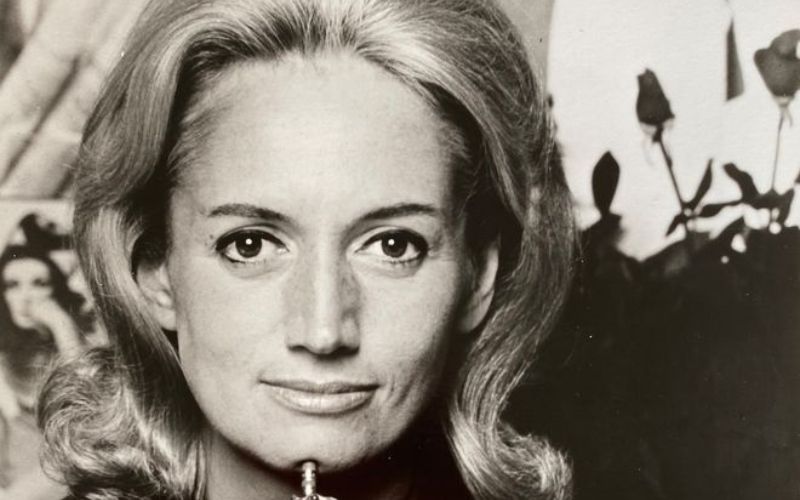
Mary Wells Lawrence
Now, let’s get back to that missing logo for the campaign.
Enter graphic designer Milton Glaser. In his first meeting with the agency in 1976, he pulled out a torn envelope on which he had quickly sketched the logo idea in red crayon while riding in a cab on his way there. What started as a simple, spontaneous idea would become a global cultural phenomenon and play a massive role in transforming New York City into the iconic metropolis it is today.

The Original Design Of I Love NY Logo
He created an emoji before emojis even existed. By using the heart symbol (an emoji before emojis were cool) and combining it with the shorthand “NY” for New York, Glaser made the message easy to understand with just three letters and a symbol.
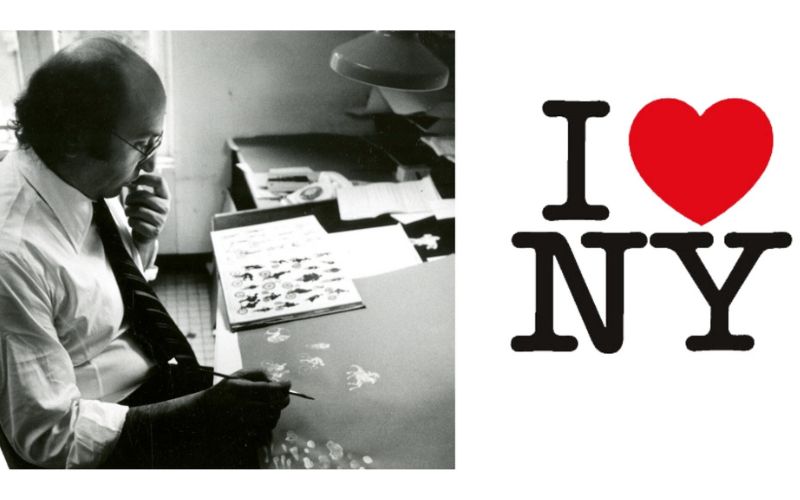
Graphic designer Milton Glaser
Sure, the heart shape has been used as shorthand for love for centuries, but this was the first time a significant ad campaign swapped the word “love” for a heart in a logo.
When it came time to design the logo, Glaser stacked the “I ❤” above the “NY,” a choice he later admitted was inspired by Robert Indiana’s famous LOVE sculpture. This design became an instant classic: simple yet powerful, with an unpretentious charm. It worked in all sizes and on every background color. And most importantly, it worked for the city.
An Icon Was Born
The simple white T-shirt featuring the pop-art-style logo quickly became a massive hit, helping spread the image and the message in a way that’s almost like a viral meme today. Soon, the logo was popping up on everything from stickers to mugs to license plates.
At a time when many people were trying to leave the crime-ridden city, the heart design resonated with those who wanted to stay and became a symbol of defiance and pride.
Glaser explained, “People were moving out, and those of us who were staying wanted to say, ‘I Love New York.’ It was a real, deeply-felt desire, and there are few chances to express our deepest feelings.”
Before long, it seemed everyone wanted to proudly declare their love for New York, both within the city and beyond its borders.
Tourism in New York skyrocketed, thanks in no small part to the campaign, which was boosted by economic initiatives and a tough-on-crime approach. The New York State Department for Economic Development, which owns the trademark for the “I Love New York” logo and licenses its use, reportedly rakes in over $100 million a year from it to this day.
An Icon Was Born
Ironically, Glaser’s iconic design created in the rounded slab serif typeface American Typewriter was done entirely pro bono as a way for him to help the city get back on its feet. In an interview, he told graphic designer Chip Kidd, “That’s what it should be. You want to do things like that, where you feel you can change things.”
An Icon Was Born (2)
A Meme Before Memes Were A Thing
What started as a campaign expected to last just a few months became a cultural phenomenon still going strong decades later. The “I ❤ New York” slogan didn’t just stick. It became a part of New York’s identity. This simple phrase is now a staple in shops worldwide, from marketing materials to every kind of souvenir you can imagine.
Over the years, countless brands and retailers have borrowed, imitated, and parodied the design to tap into that universal feeling. Whether it’s knock-offs on street corners, high-profile brands putting their twist on it, or memes that keep popping up online, this iconic graphic has taken on a life of its own.
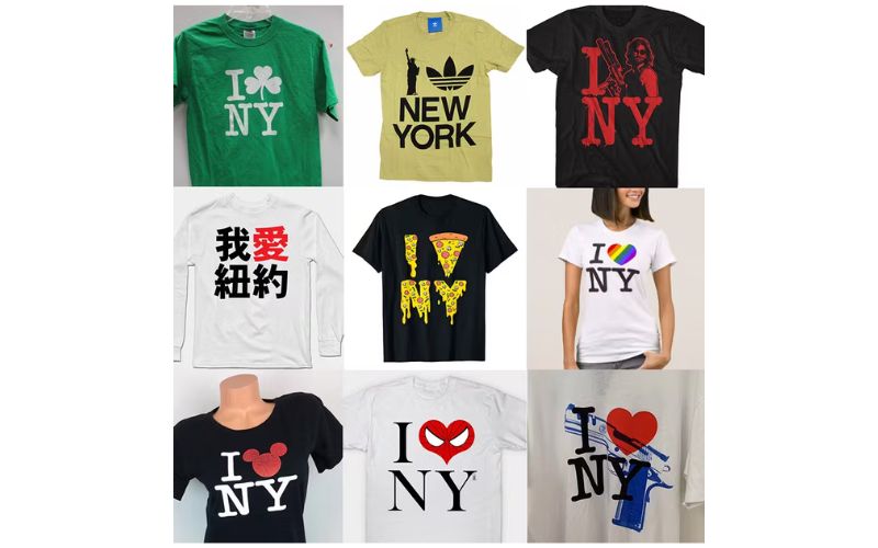
A Meme Before Memes Were A Thing
Inspiration From Tragedy
After 9/11, Milton Glaser revisited his most famous work, creating a version that reflected the heartbreak and resilience of the city. In this new design, the heart symbolized Manhattan, while a black mark represented the site of the attacks. Glaser described it as a response to the deep emotions everyone felt, a way to reaffirm New Yorkers’ love and commitment to their city.
The updated design made its way onto the cover of the Daily News and posters for the School of Visual Arts, serving as a poignant reminder of New York’s enduring spirit.
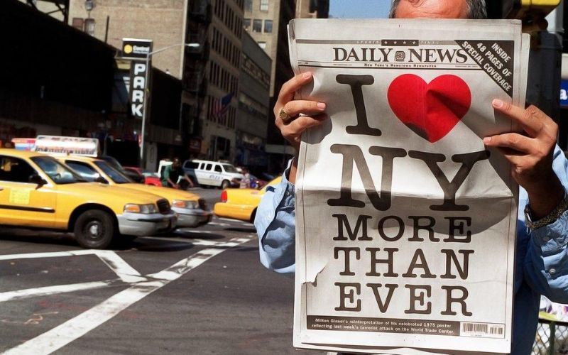
Inspiration From Tragedy
Glaser, regarded as one of the city’s most significant artistic contributors, has always credited his love of New York’s diversity as his biggest inspiration. “The great thing about New York is it’s not a single place,” he said. “You turn a corner, and you’re somewhere completely different. It’s so complex and layered that you have to invent it.”
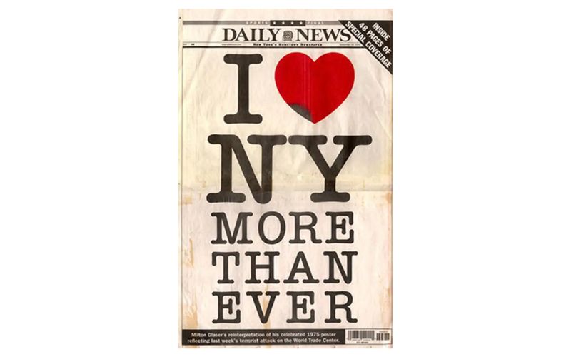
Inspiration From Tragedy (2)
How About Now?
Fast forward to more recent times. New York has continued finding new ways to use the iconic logo, even making headlines during its bid to woo Amazon into building its new regional headquarters. In an unexpected move, the city swapped “I Love NY” for “I Amazon NY” in a proposal, sparking severe reactions.
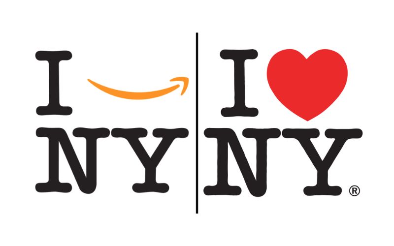
The city swapped I Love NY for I Amazon NY in a proposal
And what did Milton Glaser think of it? He wasn’t exactly thrilled. “In this particular case, the Amazon logo is not very harmonious with the rest of the design,” he said, delivering a subtle but pointed critique.

The portrait of Milton Glaser
Glaser takes on only a select few projects today, and honestly, he’s earned it. Often referred to as the godfather of modern design, his contributions inspire artists and creatives worldwide. Meanwhile, the Empire State Development Corporation keeps the “I ❤ NY” logo alive, printing it on almost everything imaginable and fiercely protecting it from imitators.
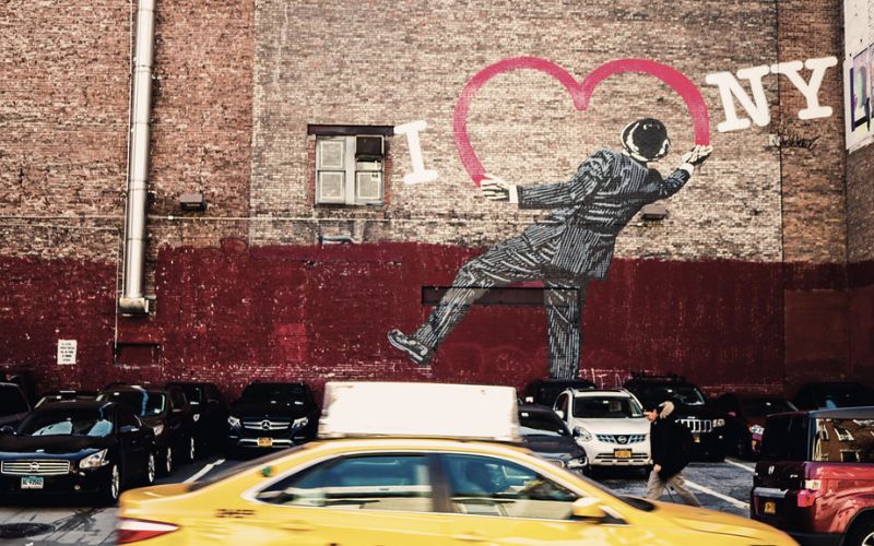
New York Empire State Development Corporation keeps the I ❤ NY logo alive
Hope you enjoyed this deep dive into one of the most famous T-shirts in history. Stay tuned for more stories from the Famous Tees of History series.
Feeling inspired? It’s your turn to create the next iconic design! Start brainstorming now.
